New Pulp Logo
![]()
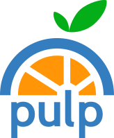
Today we’re happy to reveal that we have updated our branding for the Pulp project. This includes a few changes around our logo that I want to outline. The old logo, as you may remember, was outdated and it was time for a revamp (just in time for Pulp 3.0!). Our new logo was designed by Maria Leonova at the Red Hat Brno office.
As part of this change, we’re updating both the logo on pulpproject.org as well as the favicon for this site. There are two different flavors for the new logo: a small one with just the graphic that represent Pulp and a larger one that features the word “pulp”.
While the old Pulp logo featured very muted colors which may be hard to see for those who see color differently, our new logo’s colors create a much better contrast due to fewer colors. We also selected colors that should be easier for people with color blindness to see.
The new logo also features typography that is much more contemporary and easier to read than the old logo. Lastly, we felt the old logo was too text-centric; the new logo is more of a graphic in that it features a symbol (that of a fruit) to represent the Pulp project.
We hope you enjoy the new logo and we’d like to also thank core Pulp team member Ina Panova for organizing the effort to redesign our logo.